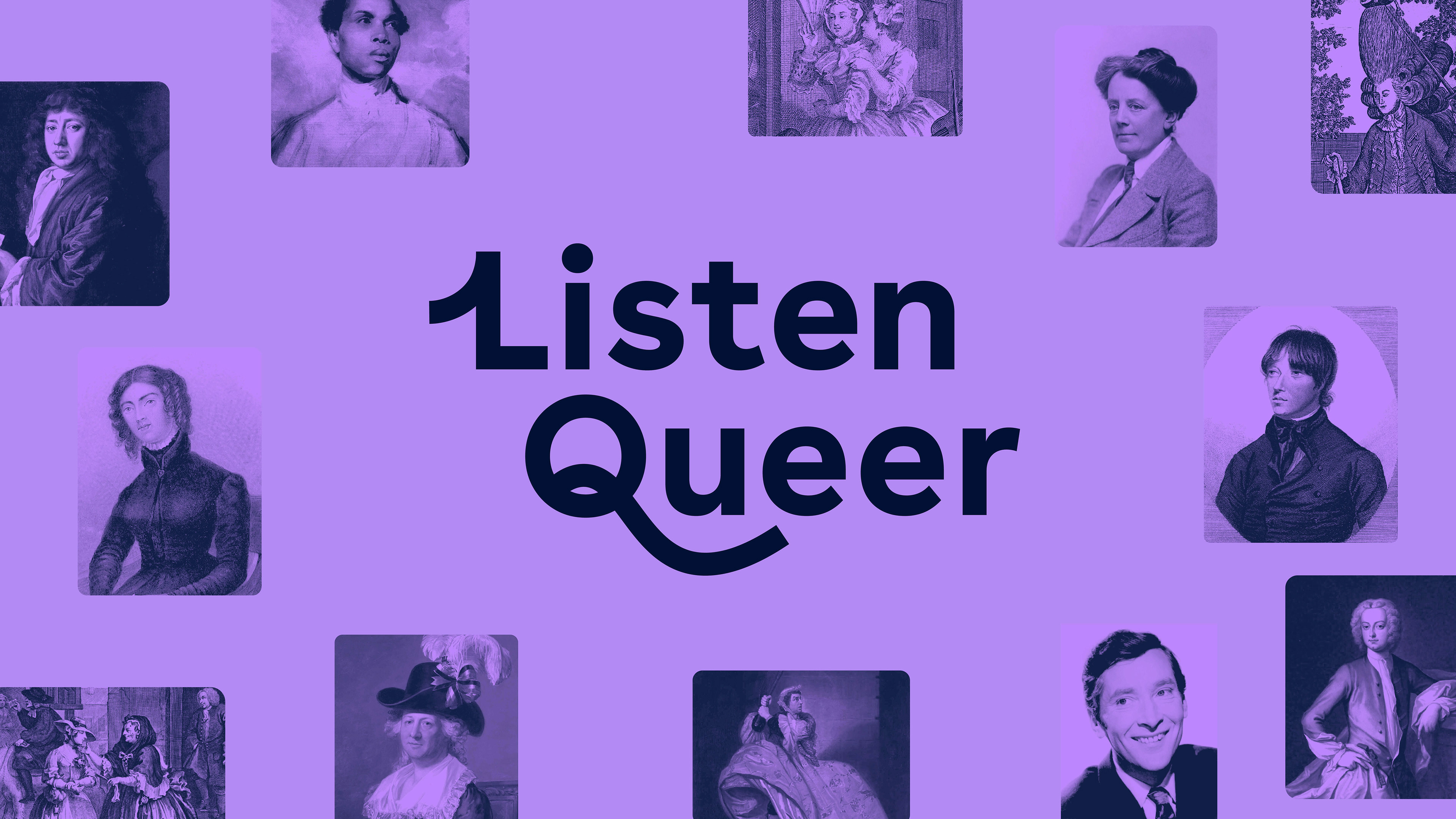
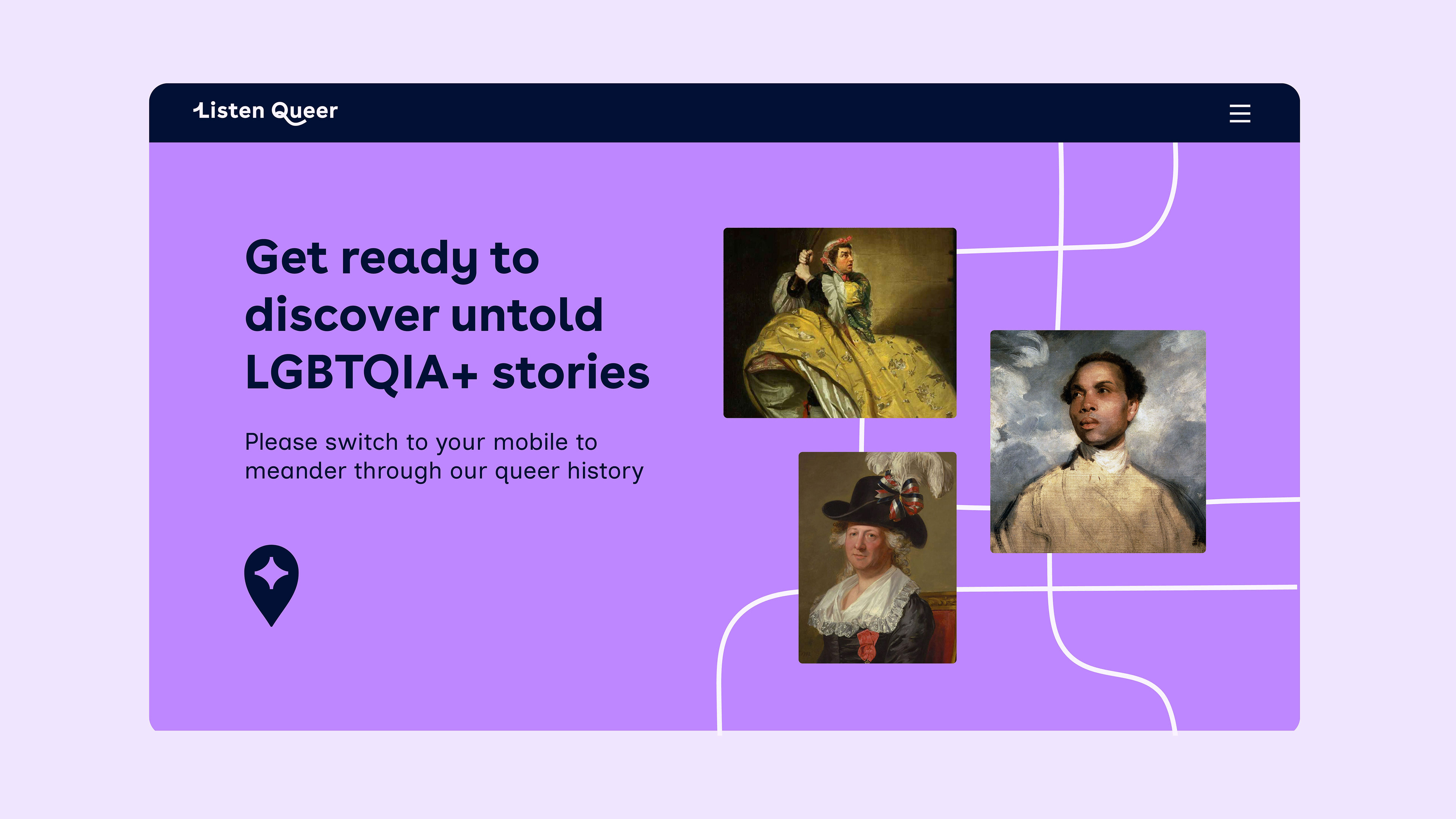
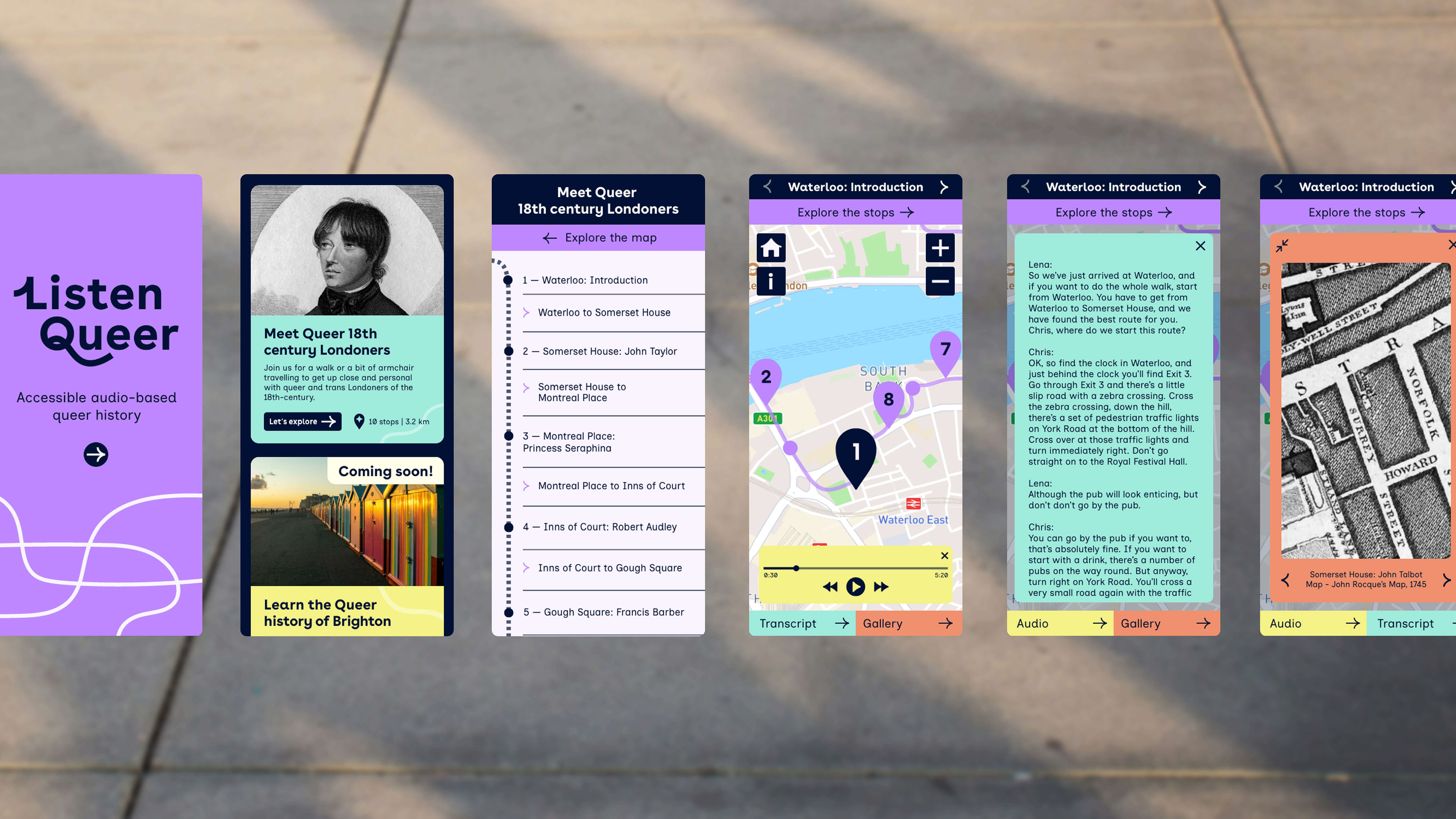
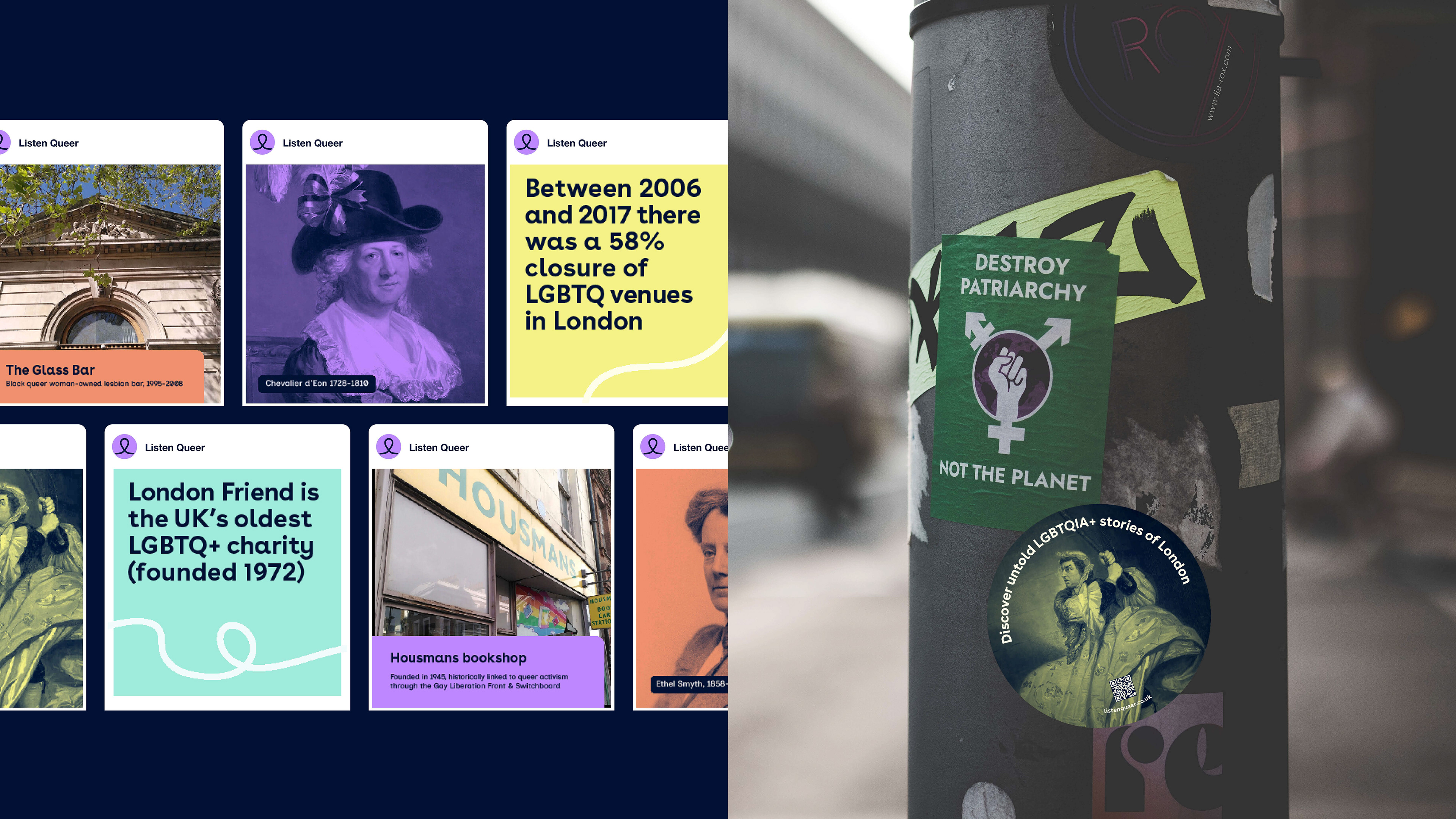
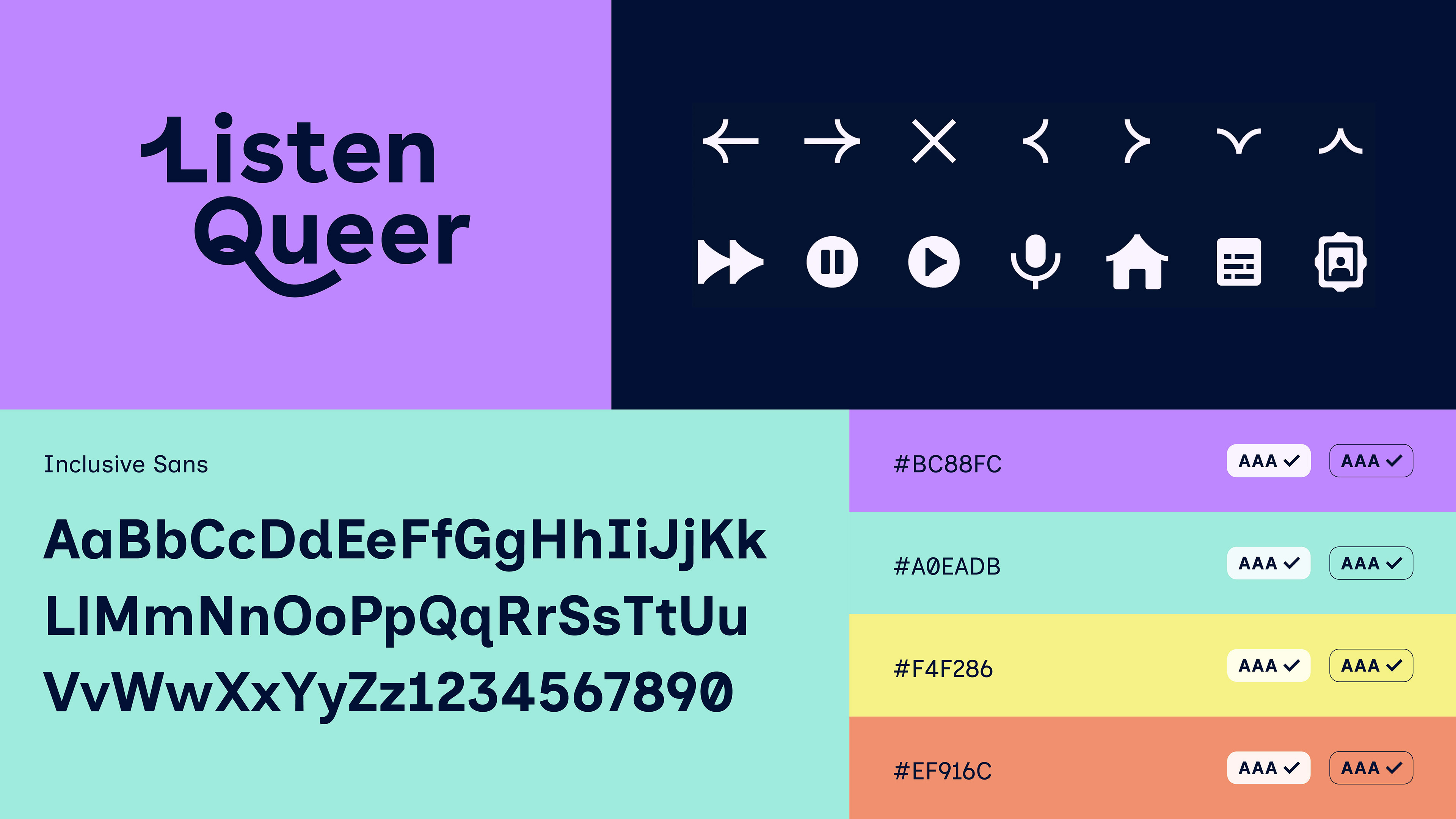
Listen Queer is an app that guides users through the vibrant LGBTQIA+ histories embedded within cities, shining a light on people and stories that are often overlooked. The idea came from Dr. Lena Mattheis and Prof. Chris Mounsey, both specialists in queer and trans literature and history. During the Covid pandemic, they envisioned a walking tour app that could share their research widely, but needed a design partner to help make it engaging, accessible, and user-friendly.
Accessibility was central from the start: Chris is partially sighted, and Lena experiences colour vision deficiency (CVD). To support readability, we chose Inclusive Sans, a typeface specifically crafted for accessibility. Its design avoids mirrored characters (such as db/qp), features a tall x-height, and uses open apertures.
The app can be experienced both outdoors as a walking tour and indoors for those who prefer exploring from home. It offers a celebratory and inclusive view of queer history. This spirit carries through the visual design: a colour palette that meets AAA contrast standards for accessibility but is vibrant and paired with a joyful, playful graphic language.
Fields:
Brand identity, Website application
Brand identity, Website application
Client:
Listen Queerd
Listen Queerd
Year:
2024
2024
Credits:
We Mean This
We Mean This